

Most guides on building a KPI dashboard stop at two steps: pick your metrics, then chart them. That advice is fine if you are building one dashboard for one business. It is close to useless for an accounting or advisory firm, where the real challenge is not building a dashboard but building one you can deploy across a book of clients, keep current every month, and tie to a forward-looking plan rather than a pile of historical actuals.
The firms that get this right treat the dashboard as a deliverable inside a system, not a one-off artifact. Here is how to build one that holds up at firm scale.
Start from the client's decisions, not the metric library
The temptation is to open a library of standard KPIs and switch on the ones that look relevant. Resist it. A dashboard earns its keep when every metric on it maps to a decision the client actually makes. For a SaaS client that means retention, CAC payback, and runway. For a contractor it means backlog, average gross margin of jobs, and AR aging. Start from "what does this client decide each month," then choose the smallest set of metrics that informs those decisions. A focused dashboard of eight drivers beats a comprehensive one of forty that nobody reads.
It also helps to tier the view by audience inside the same client. An owner or CEO wants a one-screen summary: are we on plan, what is cash doing, what needs a decision. A department head wants the operational detail underneath that headline.
Separate the financial KPIs from the operational ones, then connect both
Financial KPIs come straight from the general ledger: gross margin, EBITDA, current ratio, days sales outstanding. Operational KPIs such as pipeline, headcount, units shipped, or website traffic live in other systems, and they are usually the ones that actually predict where the financials are heading. A dashboard built only on accounting data is a rear-view mirror. The value of an advisory dashboard is in connecting operational drivers to financial outcomes, which means it is only as good as your ability to pull non-financial data in alongside the ledger through data integrations.
A staffing firm makes the point concretely. Revenue and margin are lagging indicators: by the time they move, the quarter is mostly set. The leading indicators sit upstream in operational data: open requisitions, candidate submittals, time-to-fill, and consultant utilization. A dashboard that shows utilization sliding two months before it shows up in margin gives the client room to act. One that only shows the margin gives them something to explain. The operational layer is where the forecast actually comes from.
Make it forward-looking, not just actuals
This is the step that separates a reporting dashboard from an advisory one, and most firms skip it. A KPI that only shows what already happened answers the question "how did we do." The advisory question is "are we on track, and what changes if we act." Answering it requires plan-versus-actual on every metric that matters, with the forecast sitting next to the actual. That is a modeling problem, not a charting problem. If your KPIs are not built on top of a live forecast, your dashboard can describe the past but cannot guide the next decision.
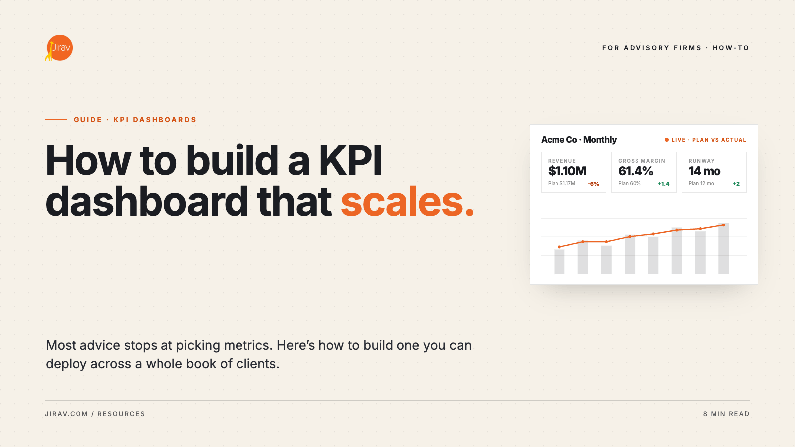
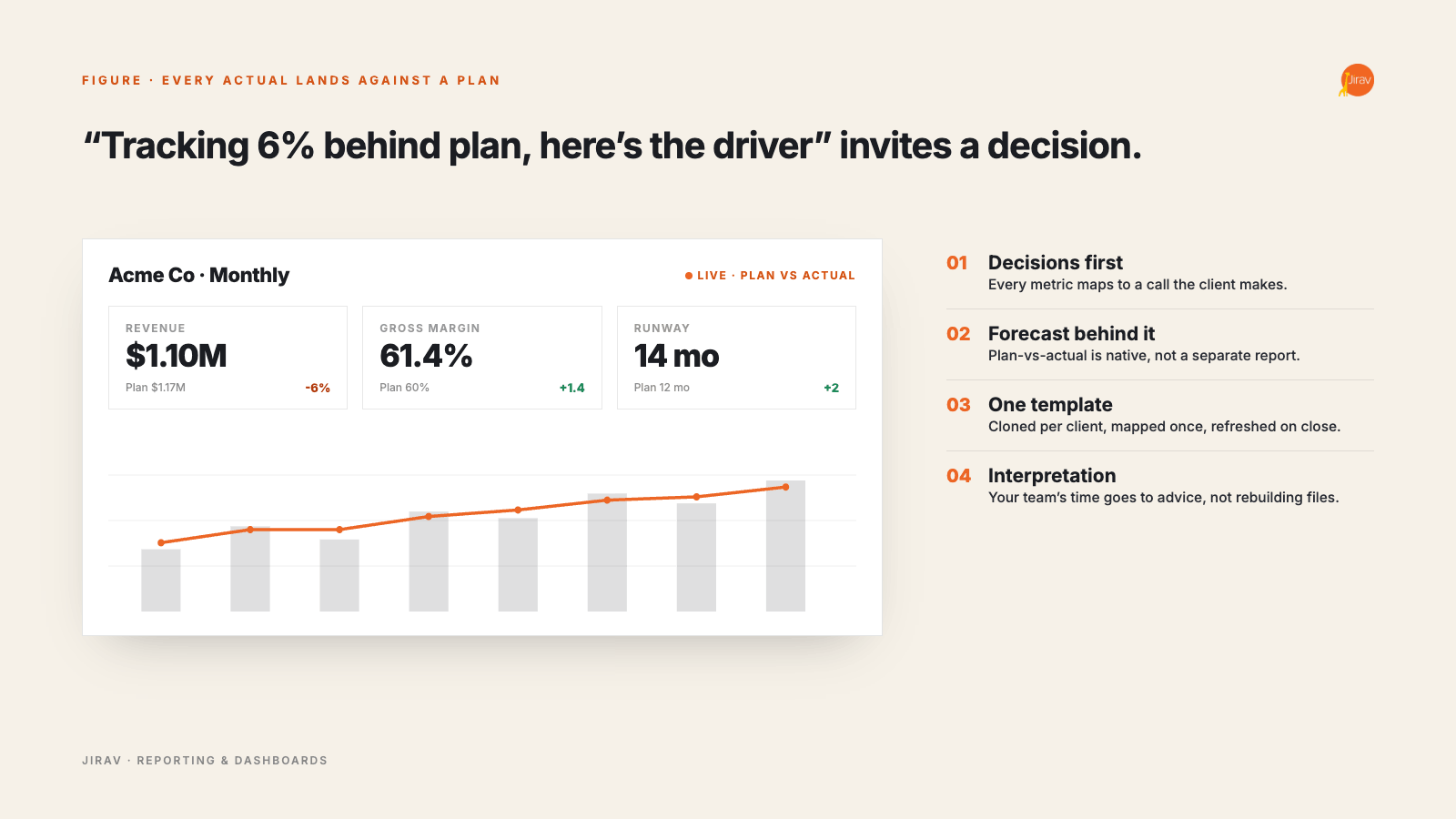
The difference shows up in the meeting. "Revenue was 1.1 million last month" invites a nod. "Revenue is tracking 6% behind plan, and here is the driver" invites a decision. The second framing only exists if the plan lives inside the dashboard, so every actual lands against a target and a variance instead of floating on its own. That variance is the entire reason the client is paying for a dashboard instead of pulling the number themselves.
Standardize so it survives a client book
One dashboard is easy. Forty dashboards, refreshed monthly by rotating staff, is where firms drown. The usual failure mode is a folder of bespoke spreadsheets, each slightly different, each a candidate for the roughly 94% of business spreadsheets that a 2024 Frontiers of Computer Science review found contain errors. Every broken formula is a client meeting spent explaining a number instead of advising on it.
Standardization is the fix: a template built once, cloned per client, with a consistent chart-of-accounts mapping and a defined set of metrics by industry. Cloning is what lets you onboard a new client in hours instead of days, and consistency is what lets a manager review ten clients' dashboards without re-learning each one. At firm scale, the standardized template is the actual product, not any individual chart.
Decide who owns the refresh, and on what cadence
A dashboard nobody owns goes stale, and a stale dashboard is worse than none because it quietly erodes trust in every number on it. Tie the refresh to the monthly close: the dashboard updates when the books close, on a fixed date, as a named step in the close process rather than an afterthought someone gets to. Clients learn the rhythm, and the recurring touchpoint is what makes the advisory relationship feel like a service instead of a periodic surprise.
The cadence only holds if the refresh is cheap. If updating a dashboard means re-exporting from the general ledger and re-pasting into a template every month, it will slip the first busy week and never fully recover. The dashboards that survive a client book are the ones wired to a live data connection, so the refresh is a sync rather than a rebuild. The question to ask of any dashboard approach is simple: when the close finishes, how many manual steps stand between you and a current dashboard. The right answer is close to zero.
Build the advisory layer on top
The dashboard is the artifact. The conversation is the product. A polished set of visuals that lands in a client's inbox with no interpretation is reporting, and reporting is the commodity end of the market. The premium sits in the meeting where you walk the client through what the metrics mean and what to do about them. The benchmark data is blunt about the payoff: firms generating significant revenue from higher-level business insights advisory earn more than 30% higher monthly recurring revenue, according to the 2024 CPA.com and AICPA PCPS CAS Benchmark Survey, than firms that stop at the deliverable. The dashboard makes that conversation efficient. It is not a substitute for it.
This reframes what you are actually selling. The client is not paying for charts; they can get charts from their accounting software. They are paying for the judgment that turns a variance into a recommendation: what the 6% miss means, whether it is a timing issue or a trend, and which of two responses you would pick. The dashboard exists to get both of you to that judgment faster. Firms that confuse the artifact for the product end up competing on price with every other dashboard vendor, which is a losing position.
Where Jirav fits
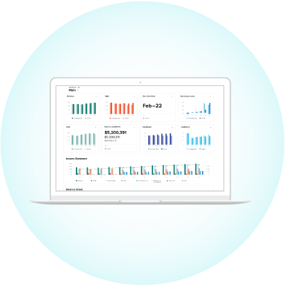
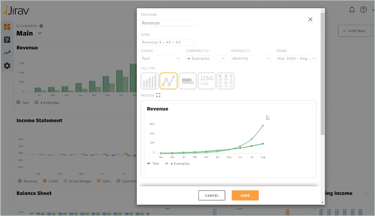
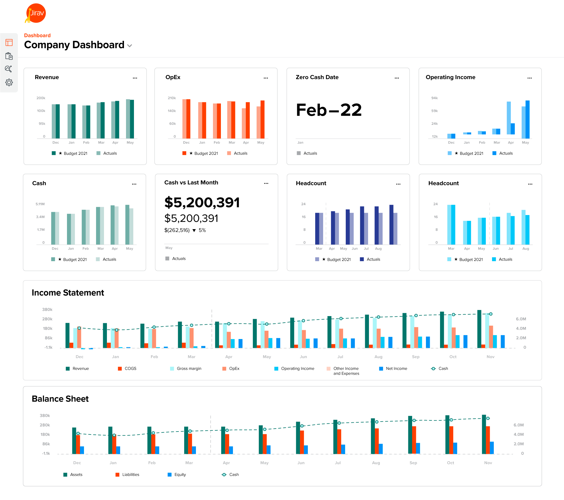
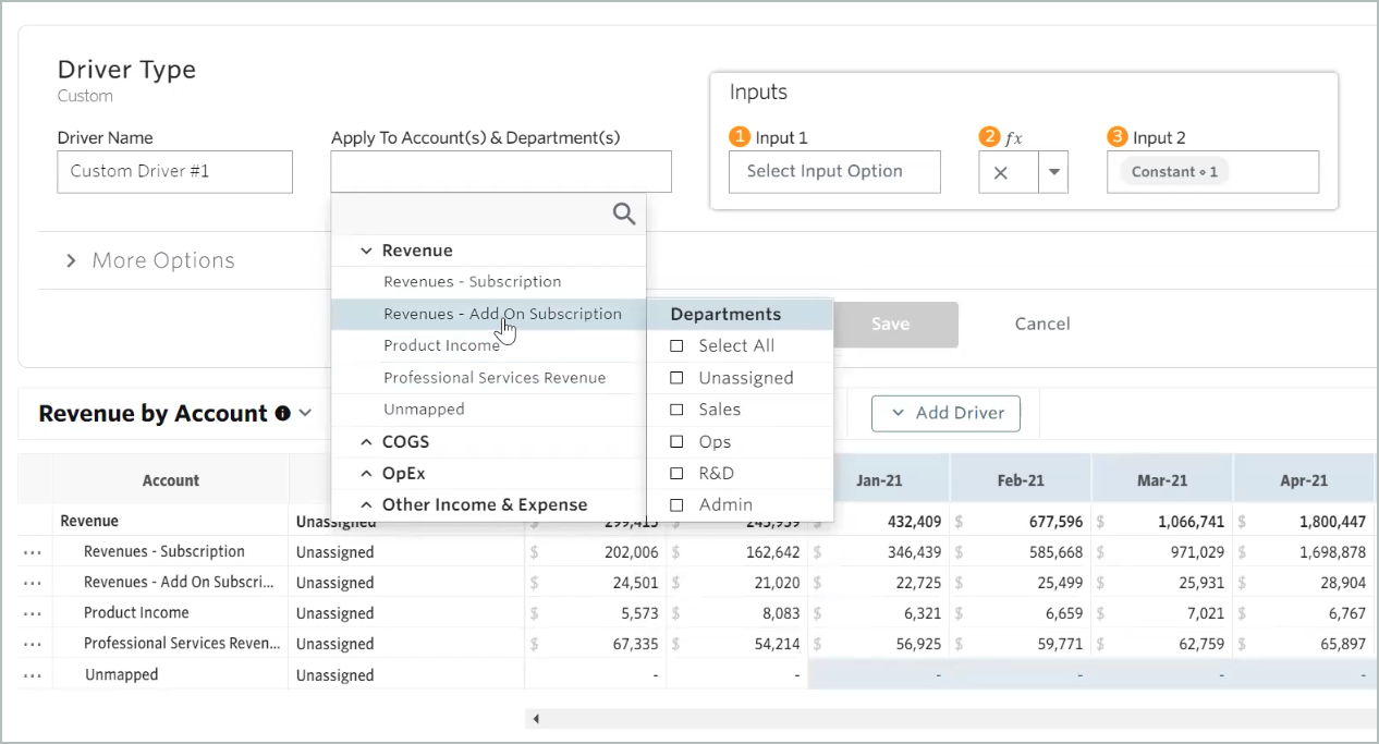
Doing all of this in spreadsheets is possible and painful. A purpose-built platform like Jirav collapses the steps. Its reporting and dashboard tools include a KPI library you can standardize across clients, point-and-click visualizations, and dashboards that combine financial and operational metrics in one view. Because Jirav is a driver-based modeling platform underneath, those KPIs can sit on a live forecast, so plan-versus-actual is built in rather than bolted on. You connect a client's accounting and operational data through integrations, build the template once, and clone it across the book.
The result is the system the manual approach only approximates: one model feeding every dashboard, standardized by industry blueprint, updated as actuals arrive, and ready for the advisory conversation the dashboard exists to support.
None of the principles above require Jirav specifically. You can build a forward-looking, standardized, well-owned dashboard in spreadsheets, and plenty of strong firms started there. The reason firms eventually move off that approach is volume: the spreadsheet method works for three clients and quietly breaks at thirty, when the monthly refresh, the version control, and the error surface stop being manageable by hand. The decision is less about features than about how many clients you intend to serve with the same small team.
Common mistakes that quietly kill a dashboard
Most dashboards do not fail loudly. They decay until the client stops opening them. Three patterns cause most of it. The first is metric sprawl: every quarter another KPI gets added and none gets removed, until the dashboard is a reference document nobody reads instead of a decision tool. A good dashboard is pruned as deliberately as it is built.
The second is vanity metrics that look impressive and inform nothing. Total registered users, cumulative revenue, lifetime signups: numbers that only ever go up and never prompt a decision. If a metric cannot trigger an action when it moves, it is decoration. The third is the static export, the dashboard that was current the day it was built and drifts further from reality every week after. A dashboard is a living view of the business or it is a screenshot, and clients can tell the difference within two meetings.
A build checklist
If you take nothing else from this, run a new client dashboard against these five tests before you ship it.
- Map each metric to a client decision, and cut anything that does not inform one.
- Separate financial and operational KPIs, and connect the operational data sources.
- Put a forecast behind every metric so plan-versus-actual is native, not a separate report.
- Build one template, clone it per client, and standardize the chart-of-accounts mapping.
- Reserve your team's time for interpretation, not for refreshing files.
A dashboard that passes all five is no longer a report. It is the spine of an advisory relationship. To see standardized, forward-looking client dashboards in action, request a walkthrough built for accounting and advisory firms.