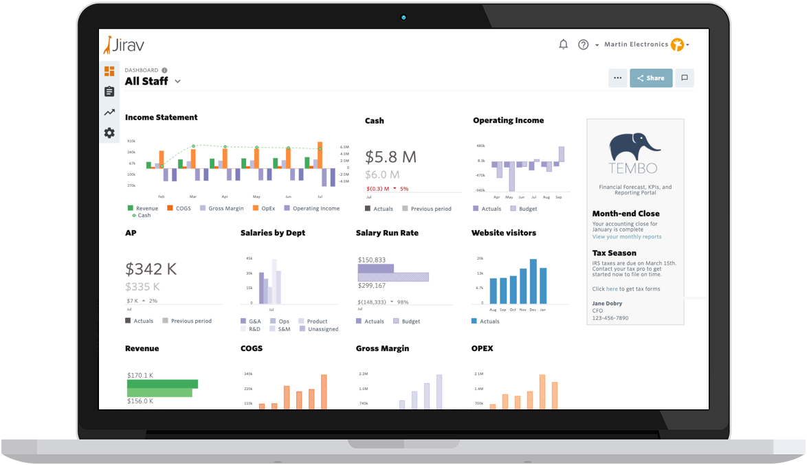
Remember when we rolled out those gorgeous new color palettes for your Jirav dashboards a few weeks ago? Well, we weren't done making your data beautiful. We've just dropped two features that'll make your dashboards not just prettier, but smarter and more readable too.
Why We're Obsessed with Great Dashboards
Here's the thing about dashboards: they're conversation starters, not conversation enders. A well-crafted dashboard doesn't just show you numbers; it tells you a story and sparks those "aha!" moments that drive real business decisions. Whether you're in a board meeting, advising a client, or in a quick coffee chat with your team, great dashboards unlock great conversations.
That's why we're constantly working to make yours even more powerful. Today, we're excited to share two features that'll help you chart the data that matters most and make it crystal clear for everyone who sees it.
Overlay Line on Vertical Chart Bars: Chart the Data That Actually Matters in a Single Tile
You know that feeling when you're trying to compare two completely different metrics but they're both crucial to your story? Like wanting to see your lemonade stand sales alongside the daily temperature this summer - totally different scales, but the relationship matters.
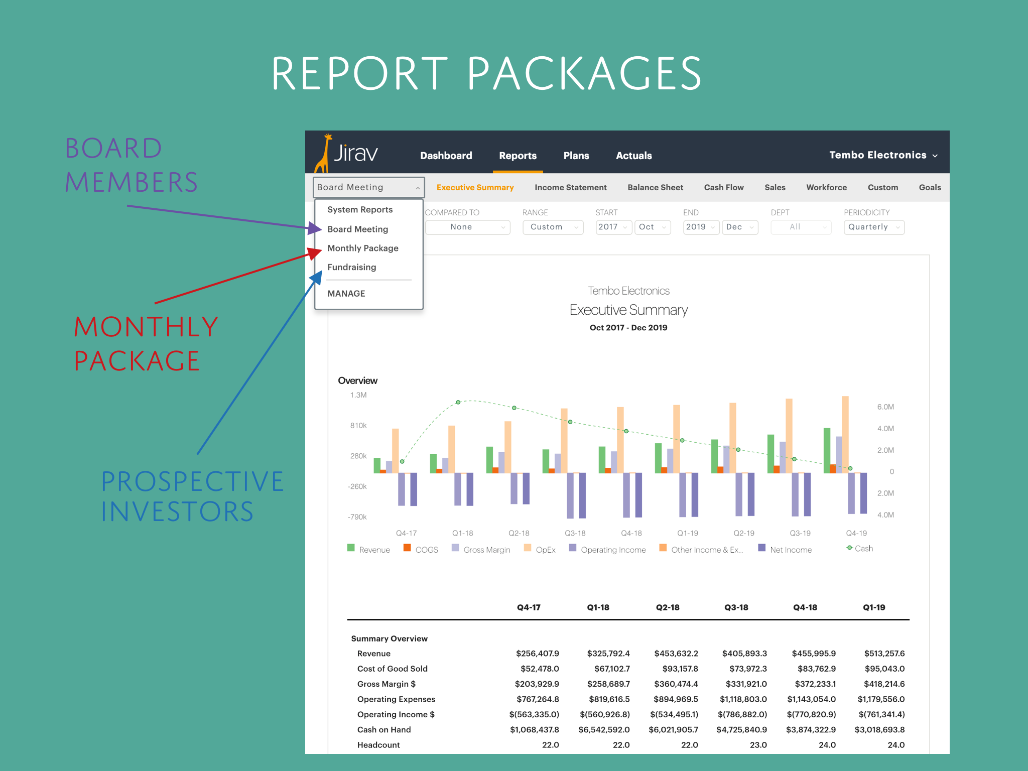
We've solved this with our new overlay line feature for vertical bar charts. Now you can chart two data points with different scales using a secondary y-axis. Here's how this works in the real world and corporate context:
Picture this: You want to show your in-store revenue as bars (measured in dollars on the left axis) with an overlay line showing actual units sold (measured in quantity on the right axis). Boom 💥 now you can spot patterns and raise questions like "Our revenue went up, but did we actually sell more stuff or just raise prices?"
Here are some other powerful combinations you can create:
- Revenue (bars) + Email campaigns sent (overlay line) → See if your marketing efforts actually drive sales
- Monthly costs (bars) + Support staff headcount (overlay line) → Understand if you're scaling support with business growth
- Gross profit (bars) + Cash flow (overlay line) → Track profitability alongside liquidity
- Customer acquisition cost (bars) + Website traffic (overlay line) → Compare your marketing spend for acquiring new customers to actual visitor volume
- Inventory costs (bars) + Days of inventory (overlay line) → Balance your cash tied up in stock with supply security
- Cash each month (bars) + Burn Rate (overlay line) → Stay on top of run rate
The beauty is in the relationship between these metrics…stories your data was trying to tell you all along, but couldn't quite capture in a single snapshot.
Updated Data Labels That Don't Make You Squint
Let's be honest – cramped, overlapping, or sideways labels are the enemy of good data visualization. We've added some neat customization options for your data value and series labels so your charts are as readable as they are insightful.
Now you can adjust label orientation (hello, vertical text for those crowded charts!), position labels inside or outside bars, and even show overlapping labels when you need every data point visible. No more playing "guess the hidden number" with your own dashboard.
See it in Action
The below video below walks you through both of these features step-by-step, so you can start using them right away.
Want a Dashboard Refresher?
If you'd like to brush up on the fundamentals of creating dashboards in Jirav, check out the video below for a complete walkthrough.
Get Started Today
Ready to make your dashboards work harder for you? These features are live now, and we can't wait to see what stories your data tells with these new tools. As always, check out our help center for detailed guides.


